In the year 2020, based on the table above, we expect about a 6.8% increase in deaths over 2017 through 2019 due to population increase
and population aging. The graph below shows that in that year the increase in deaths substantially increased above this number, peaking at
43% over the expected deaths during the week of April 10. Looking at the year 2023, we expect about a 13.1% increase in deaths over
2017 through 2019 due to population increase and population aging. Though a bit early to tell at this writing (March 2023), it appears
the excess death rate (over 2017-2019) is running in this area. As such, the contribution due to unusual disease such as
covid 19 may be over. Not considered in this analysis, however, would be a decrease in future deaths due to deaths occuring
earlier than expected (you only die once).
According to this document at medium.com, the timeline
for infections ending in death averages as below:
- Exposure
- 2 - 14 days after exposure - Symptoms appear
- 2 - 8 weeks after symptoms appear - Death
Case counts (especially cases per 100,000 population) are a leading indicator. An increase in case counts is likely to result in an increase in deaths a couple months later.
However, with vaccination and improved treatment, I expect the ratio of deaths to cases to decrease over time.
- Left drag mouse over area to zoom to that area; right click to zoom back to full
- The lines converge on early report with the green line being drawn last. Where there is only a green and purple line, the green line represents the actual excess deaths.
Where the lines diverge, the lines have the meanings explained below.
- Blue line is percentage of expected deaths this week as reported by the CDC.
- Red line is the predicted percentage of expected deaths based on reports received from the CDC so far and corrected based on typical reporting delay.
- Green line is the predicted maximum percentage of expected deaths based on reports received from the CDC so far and corrected based on the
maximum reporting delay (early reports are low percentage of final value). Because of the wide variation between early reports and final values, the green line
is limited to 200% to keep the graph at a reasonable scale.
- Orange line is the predicted minimum percentage of expected deaths based on reports received from the CDC so far and corrected based on the
minimum reporting delay (early reports are high percentage of final value).
- Purple line is the accumulated percentage of expected deaths based on data received from the CDC so far.
To Date Summary
The table below shows the actual number of reported deaths since 1/1/20, the expected nmber of deaths, and the excess number of deaths. As discussed above,
the expected number is based on the same period for the years 2017 through 2019.
Predictions Based On Early Reports
As discussed above, it takes several weeks for the CDC to receive all the death reports for a
specific week. In an attempt to get more current data, a "correction factor" has been developed
based on how the percent expected deaths increases after the week of death as more reports are
received. Data on report delays has been gathered from June 15, 2020 through May 29, 2021.
This data is here.
The summary data used for the predictions is here.
The "Average Percent of Max" (not really shown as percent; 1.00 = 100%) is the portion of the
final value that shows up the specified number of days after the end of the week of the death.
The "final value" is the maximum value over time for that weeek as additional reports arrive at
the CDC. The reported CDC percent of expected deaths is divided by the Average Percent of Max
for the number of days between the end of the week of death and the CDC update date to yield
the predicted percent of expected deaths. Based on this data, a predicted percentage of
expected deaths is determined immediately following the week of death. As the CDC updates
their numbers (every weekday), the correction factors are updated and the predicted percentage
of expected deaths is updated. Along with a prediction based on the average correction factor,
predictions are made based on the minimum and maximum prediction factors. These are the minimum
percentage of final value the specified number of days after the end of week of the reported
deaths and the maximum percentage of final value. Data is included in the prediction factor
calculations once the percentage of expected deaths as reported by the CDC is unchanged for
a week (making it appear this close to the final value). NOTE that the predicated values
depend upon consistent reporting rates. If data to the CDC arrives faster than it has in the
past, the predicted values will be higher. A graph of the reporting delay is below.
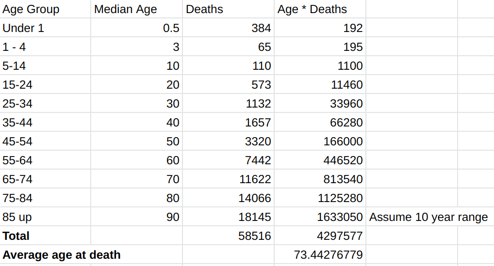
Average Age at Time of Death
The CDC does not publish data revealing the average age at death each week. They do, however, make data available showing the total number
of deaths in approximate 10 year age groups each week. This data is here
(CSV).
In the graph below, this data is used to compute an average age at death for each week. Records are used where the following conditions are satisfied:
- state is United States
- sex is All Sex
The number of deaths in each age group is multiplied by
the average age of that group (for example, the group 25-34 years uses an age of 30 years). These products are then added and divided by the
total number of deaths in all age groups to yield an average age at death. Note that the age used for the 85 and older group is 90 years,
the average in an 85 to 94 age group. Because the chart is not comparing age at time of death to historic values as the Percent of Expected Deaths
chart, above, is, there may be seasonal effects that influence the chart.
Left drag mouse over area to zoom to that area; right click to zoom back to full
At first, I was expecting the age at death to decrease due to covid-19. We could then say covid-19 has resulted in so many years loss of life.
However, it appears that covid-19 has, instead, just upset the balance in the number of deaths between different age groups. It has caused
more older people to die causing the average age at time of death to increase. When percentage of expected deaths peaked in April 2020,
the average age at death also peaked. When the percentage of expected deaths decreased in June 2020, fewer elderly were dying, so the
average age at death also decreased. Then, as the percentage of expected deaths increased in July 2020, the average age at death also
increased.
It's interesting to compare this with other data. For example, the
life expectancy for someone born today in the US is about 78.539 years (as of 2018). However, people dying today were not born today, so
today's life expectancy is not appropriate. We might look at the median age of the US population (38.2 years according to Wikipedia. We could then look at the life expectancy for those
born in 1982. The life expectancy chart shows
a life expectancy of 74.361 years for those born in 1982. That is still higher than the average age at death shown in the graph above.
Looking at the graph above, we are seeing people die at about age 73. Thus they were born around 1947. Life expectancy for those born in
1950 is about 68.2 years according to this CDC document. The current 73 years
is between the expected 68.2 years and the expected 74.361 years. As mentioned before, there are likely to be seasonal effects, but there
is a fairly dramatic variation in age at death.
The image below demonstrates
the average age at death calculation for February 1, 2020. It can be used to verify the average age at death calculations used to create the graph.
The below calculation was done several months ago, and since then more data has shown up. This results in a slight difference between the below
calculation and the data in the above graph. The graph above always uses the latest data.
Other Resources
- CDC Wastewater Surveillance - Concentration of
Covid virus and 15 day change in concentration in wastewater samples on a plant by plant basis. Provides a good random sampling
of Covid in a community.
- CDC Community Level - Check
covid risk levels in US counties to determine what precautions, such as mask wearing, to use.
- CDC Coronavirus (COVID-19) - Extensive resources.
- CDC Provisional Death Counts for Coronavirus Disease 2019 (COVID-19) - Daily updates
of deaths involving coronavirus disease 2019 (COVID-19), pneumonia, and influenza reported to NCHS by week ending date and by state.
This is the source of the data used on this page. Note that the deaths in a week are the deaths that actually occurred in that week, and
it takes time for those reports to arrive at the CDC. This is different from data from the New York Times, below, where the date
shown is the date the death is reported as opposed to the date it occurred.
- Excess Deaths Associated with COVID-19 - Extensive analysis by the CDC.
Shows actual detah counts compared with expected for each week. You can see the seasonal effects clearly. The page also includes an extensive explanation
of the analysis techniques including predictions of the number of deaths in a particular week based on early reports.
- Colorado Outbreak Data
- New York Times Covid in the U.S.: Latest Map and Case Count -
Updated daily with case count, death count, and geographic data. Note that the chart "New reported deaths by day in the United States" is based
on the date of the report, not the date of the death, as used in the CDC data shown above. This causes dramatic drops in the reported
deaths on weekends. There are deaths on weekends, but they are often reported later in the week. Also, as shown above, there can
be a substantial delay between the date of death and the report reaching the CDC.
- ‘Excess Deaths’ in 2020 Surpassed Those of 1918 Flu Pandemic -
Extensive analysis in the New York Times
- U.S. .excess deaths. during pandemic surpassed 1 million, with covid killing most
but other diseases adding to the toll, CDC says, Washington Post, 2/15/2022
- Coronavirus disease (COVID-19) pandemic - Extensive resources.
Raw CDC Data
On 1/19/21, the CDC revised their website making it difficult to see the complete set of expected death data. The table below pulls the latest data
from the CDC JSON data (https://data.cdc.gov/resource/r8kw-7aab.json). Note that the ending
data is very low because it takes several weeks for the CDC to receive the death reports. The data below is based on the date of death, not the
date the report is received. The percent of expected deaths will increase as more reports are received. The graph near the top of the page
applies prediction factors to this data to yield a predicted percentage of expected deaths based on typical reporting delays.
CDC Data as of 07/09/2026
| Week Ending | Percent of Expected Deaths |
|---|
| 01/04/2020 | 98.00 |
| 01/11/2020 | 97.00 |
| 01/18/2020 | 98.00 |
| 01/25/2020 | 99.00 |
| 02/01/2020 | 99.00 |
| 02/08/2020 | 100 |
| 02/15/2020 | 100 |
| 02/22/2020 | 101.00 |
| 02/29/2020 | 103.00 |
| 03/07/2020 | 103.00 |
| 03/14/2020 | 103.00 |
| 03/21/2020 | 104.00 |
| 03/28/2020 | 113.00 |
| 04/04/2020 | 130.0 |
| 04/11/2020 | 143.00 |
| 04/18/2020 | 142.00 |
| 04/25/2020 | 138.00 |
| 05/02/2020 | 129.00 |
| 05/09/2020 | 127.00 |
| 05/16/2020 | 123.00 |
| 05/23/2020 | 119.00 |
| 05/30/2020 | 115.00 |
| 06/06/2020 | 113.00 |
| 06/13/2020 | 112.00 |
| 06/20/2020 | 112.00 |
| 06/27/2020 | 114.00 |
| 07/04/2020 | 115.00 |
| 07/11/2020 | 121.00 |
| 07/18/2020 | 124.00 |
| 07/25/2020 | 127.00 |
| 08/01/2020 | 126.00 |
| 08/08/2020 | 125.00 |
| 08/15/2020 | 126.00 |
| 08/22/2020 | 124.00 |
| 08/29/2020 | 120.0 |
| 09/05/2020 | 118.00 |
| 09/12/2020 | 116.00 |
| 09/19/2020 | 116.00 |
| 09/26/2020 | 117.00 |
| 10/03/2020 | 114.00 |
| 10/10/2020 | 118.00 |
| 10/17/2020 | 114.00 |
| 10/24/2020 | 116.00 |
| 10/31/2020 | 118.00 |
| 11/07/2020 | 124.00 |
| 11/14/2020 | 125.00 |
| 11/21/2020 | 130.0 |
| 11/28/2020 | 133.00 |
| 12/05/2020 | 137.00 |
| 12/12/2020 | 143.00 |
| 12/19/2020 | 143.00 |
| 12/26/2020 | 144.00 |
| 01/02/2021 | 148.00 |
| 01/09/2021 | 141.00 |
| 01/16/2021 | 140.0 |
| 01/23/2021 | 137.00 |
| 01/30/2021 | 133.00 |
| 02/06/2021 | 129.00 |
| 02/13/2021 | 120.0 |
| 02/20/2021 | 118.00 |
| 02/27/2021 | 115.00 |
| 03/06/2021 | 111.00 |
| 03/13/2021 | 107.00 |
| 03/20/2021 | 106.00 |
| 03/27/2021 | 107.00 |
| 04/03/2021 | 105.00 |
| 04/10/2021 | 109.00 |
| 04/17/2021 | 107.00 |
| 04/24/2021 | 112.00 |
| 05/01/2021 | 111.00 |
| 05/08/2021 | 110.0 |
| 05/15/2021 | 111.00 |
| 05/22/2021 | 112.00 |
| 05/29/2021 | 110.0 |
| 06/05/2021 | 111.00 |
| 06/12/2021 | 109.00 |
| 06/19/2021 | 111.00 |
| 06/26/2021 | 110.0 |
| 07/03/2021 | 112.00 |
| 07/10/2021 | 110.0 |
| 07/17/2021 | 112.00 |
| 07/24/2021 | 115.00 |
| 07/31/2021 | 119.00 |
| 08/07/2021 | 125.00 |
| 08/14/2021 | 131.00 |
| 08/21/2021 | 138.00 |
| 08/28/2021 | 143.00 |
| 09/04/2021 | 144.00 |
| 09/11/2021 | 144.00 |
| 09/18/2021 | 142.00 |
| 09/25/2021 | 140.0 |
| 10/02/2021 | 138.00 |
| 10/09/2021 | 132.00 |
| 10/16/2021 | 129.00 |
| 10/23/2021 | 126.00 |
| 10/30/2021 | 124.00 |
| 11/06/2021 | 124.00 |
| 11/13/2021 | 124.00 |
| 11/20/2021 | 122.00 |
| 11/27/2021 | 123.00 |
| 12/04/2021 | 127.00 |
| 12/11/2021 | 128.00 |
| 12/18/2021 | 125.00 |
| 12/25/2021 | 125.00 |
| 01/01/2022 | 127.00 |
| 01/08/2022 | 130.0 |
| 01/15/2022 | 136.00 |
| 01/22/2022 | 141.00 |
| 01/29/2022 | 143.00 |
| 02/05/2022 | 137.00 |
| 02/12/2022 | 130.0 |
| 02/19/2022 | 121.00 |
| 02/26/2022 | 114.00 |
| 03/05/2022 | 112.00 |
| 03/12/2022 | 107.00 |
| 03/19/2022 | 106.00 |
| 03/26/2022 | 103.00 |
| 04/02/2022 | 104.00 |
| 04/09/2022 | 104.00 |
| 04/16/2022 | 105.00 |
| 04/23/2022 | 105.00 |
| 04/30/2022 | 107.00 |
| 05/07/2022 | 107.00 |
| 05/14/2022 | 110.0 |
| 05/21/2022 | 110.0 |
| 05/28/2022 | 110.0 |
| 06/04/2022 | 111.00 |
| 06/11/2022 | 111.00 |
| 06/18/2022 | 112.00 |
| 06/25/2022 | 113.00 |
| 07/02/2022 | 113.00 |
| 07/09/2022 | 113.00 |
| 07/16/2022 | 114.00 |
| 07/23/2022 | 118.00 |
| 07/30/2022 | 117.00 |
| 08/06/2022 | 117.00 |
| 08/13/2022 | 115.00 |
| 08/20/2022 | 116.00 |
| 08/27/2022 | 116.00 |
| 09/03/2022 | 114.00 |
| 09/10/2022 | 115.00 |
| 09/17/2022 | 113.00 |
| 09/24/2022 | 114.00 |
| 10/01/2022 | 113.00 |
| 10/08/2022 | 114.00 |
| 10/15/2022 | 114.00 |
| 10/22/2022 | 113.00 |
| 10/29/2022 | 112.00 |
| 11/05/2022 | 113.00 |
| 11/12/2022 | 113.00 |
| 11/19/2022 | 113.00 |
| 11/26/2022 | 117.00 |
| 12/03/2022 | 119.00 |
| 12/10/2022 | 119.00 |
| 12/17/2022 | 116.00 |
| 12/24/2022 | 118.00 |
| 12/31/2022 | 120.0 |
| 01/07/2023 | 112.00 |
| 01/14/2023 | 107.00 |
| 01/21/2023 | 106.00 |
| 01/28/2023 | 105.00 |
| 02/04/2023 | 106.00 |
| 02/11/2023 | 106.00 |
| 02/18/2023 | 105.00 |
| 02/25/2023 | 107.00 |
| 03/04/2023 | 107.00 |
| 03/11/2023 | 105.00 |
| 03/18/2023 | 107.00 |
| 03/25/2023 | 107.00 |
| 04/01/2023 | 108.00 |
| 04/08/2023 | 106.00 |
| 04/15/2023 | 108.00 |
| 04/22/2023 | 109.00 |
| 04/29/2023 | 108.00 |
| 05/06/2023 | 109.00 |
| 05/13/2023 | 110.0 |
| 05/20/2023 | 109.00 |
| 05/27/2023 | 108.00 |
| 06/03/2023 | 110.0 |
| 06/10/2023 | 108.00 |
| 06/17/2023 | 109.00 |
| 06/24/2023 | 108.00 |
| 07/01/2023 | 109.00 |
| 07/08/2023 | 108.00 |
| 07/15/2023 | 109.00 |
| 07/22/2023 | 110.0 |
| 07/29/2023 | 111.00 |
| 08/05/2023 | 111.00 |
| 08/12/2023 | 111.00 |
| 08/19/2023 | 112.00 |
| 08/26/2023 | 112.00 |
| 09/02/2023 | 111.00 |
| 09/09/2023 | 112.00 |
| 09/16/2023 | 110.0 |
| 09/23/2023 | 111.00 |
| 09/30/2023 | 111.00 |
| 10/07/2023 | 111.00 |
| 10/14/2023 | 112.00 |
| 10/21/2023 | 110.0 |
| 10/28/2023 | 110.0 |
| 11/04/2023 | 110.0 |
| 11/11/2023 | 111.00 |
| 11/18/2023 | 109.00 |
| 11/25/2023 | 108.00 |
| 12/02/2023 | 113.00 |
| 12/09/2023 | 113.00 |
| 12/16/2023 | 110.0 |
| 12/23/2023 | 111.00 |
| 12/30/2023 | 112.00 |
| 01/06/2024 | 109.00 |
| 01/13/2024 | 110.0 |
| 01/20/2024 | 110.0 |
| 01/27/2024 | 111.00 |
| 02/03/2024 | 106.00 |
| 02/10/2024 | 105.00 |
| 02/17/2024 | 104.00 |
| 02/24/2024 | 106.00 |
| 03/02/2024 | 106.00 |
| 03/09/2024 | 105.00 |
| 03/16/2024 | 105.00 |
| 03/23/2024 | 103.00 |
| 03/30/2024 | 105.00 |
| 04/06/2024 | 106.00 |
| 04/13/2024 | 107.00 |
| 04/20/2024 | 107.00 |
| 04/27/2024 | 107.00 |
| 05/04/2024 | 107.00 |
| 05/11/2024 | 108.00 |
| 05/18/2024 | 108.00 |
| 05/25/2024 | 109.00 |
| 06/01/2024 | 108.00 |
| 06/08/2024 | 109.00 |
| 06/15/2024 | 109.00 |
| 06/22/2024 | 109.00 |
| 06/29/2024 | 111.00 |
| 07/06/2024 | 109.00 |
| 07/13/2024 | 110.0 |
| 07/20/2024 | 110.0 |
| 07/27/2024 | 111.00 |
| 08/03/2024 | 112.00 |
| 08/10/2024 | 111.00 |
| 08/17/2024 | 112.00 |
| 08/24/2024 | 112.00 |
| 08/31/2024 | 111.00 |
| 09/07/2024 | 110.0 |
| 09/14/2024 | 111.00 |
| 09/21/2024 | 110.0 |
| 09/28/2024 | 109.00 |
| 10/05/2024 | 108.00 |
| 10/12/2024 | 110.0 |
| 10/19/2024 | 108.00 |
| 10/26/2024 | 108.00 |
| 11/02/2024 | 107.00 |
| 11/09/2024 | 107.00 |
| 11/16/2024 | 105.00 |
| 11/23/2024 | 106.00 |
| 11/30/2024 | 105.00 |
| 12/07/2024 | 107.00 |
| 12/14/2024 | 109.00 |
| 12/21/2024 | 107.00 |
| 12/28/2024 | 108.00 |
| 01/04/2025 | 105.00 |
| 01/11/2025 | 108.00 |
| 01/18/2025 | 112.00 |
| 01/25/2025 | 114.00 |
| 02/01/2025 | 117.00 |
| 02/08/2025 | 115.00 |
| 02/15/2025 | 114.00 |
| 02/22/2025 | 116.00 |
| 03/01/2025 | 116.00 |
| 03/08/2025 | 113.00 |
| 03/15/2025 | 112.00 |
| 03/22/2025 | 108.00 |
| 03/29/2025 | 108.00 |
| 04/05/2025 | 106.00 |
| 04/12/2025 | 107.00 |
| 04/19/2025 | 108.00 |
| 04/26/2025 | 108.00 |
| 05/03/2025 | 107.00 |
| 05/10/2025 | 108.00 |
| 05/17/2025 | 110.0 |
| 05/24/2025 | 109.00 |
| 05/31/2025 | 108.00 |
| 06/07/2025 | 109.00 |
| 06/14/2025 | 109.00 |
| 06/21/2025 | 109.00 |
| 06/28/2025 | 110.0 |
| 07/05/2025 | 109.00 |
| 07/12/2025 | 110.0 |
| 07/19/2025 | 110.0 |
| 07/26/2025 | 110.0 |
| 08/02/2025 | 109.00 |
| 08/09/2025 | 110.0 |
| 08/16/2025 | 111.00 |
| 08/23/2025 | 111.00 |
| 08/30/2025 | 109.00 |
| 09/06/2025 | 110.0 |
| 09/13/2025 | 109.00 |
| 09/20/2025 | 109.00 |
| 09/27/2025 | 109.00 |
| 10/04/2025 | 106.00 |
| 10/11/2025 | 107.00 |
| 10/18/2025 | 107.00 |
| 10/25/2025 | 106.00 |
| 11/01/2025 | 107.00 |
| 11/08/2025 | 109.00 |
| 11/15/2025 | 107.00 |
| 11/22/2025 | 106.00 |
| 11/29/2025 | 103.00 |
| 12/06/2025 | 107.00 |
| 12/13/2025 | 108.00 |
| 12/20/2025 | 108.00 |
| 12/27/2025 | 106.00 |
| 01/03/2026 | 111.00 |
| 01/10/2026 | 107.00 |
| 01/17/2026 | 104.00 |
| 01/24/2026 | 105.00 |
| 01/31/2026 | 107.00 |
| 02/07/2026 | 109.00 |
| 02/14/2026 | 106.00 |
| 02/21/2026 | 106.00 |
| 02/28/2026 | 106.00 |
| 03/07/2026 | 106.00 |
| 03/14/2026 | 102.00 |
| 03/21/2026 | 104.00 |
| 03/28/2026 | 103.00 |
| 04/04/2026 | 104.00 |
| 04/11/2026 | 103.00 |
| 04/18/2026 | 105.00 |
| 04/25/2026 | 105.00 |
| 05/02/2026 | 104.00 |
| 05/09/2026 | 107.00 |
| 05/16/2026 | 108.00 |
| 05/23/2026 | 107.00 |
| 05/30/2026 | 104.00 |
| 06/06/2026 | 105.00 |
| 06/13/2026 | 101.00 |
| 06/20/2026 | 93.00 |
| 06/27/2026 | 75.00 |
| 07/04/2026 | 39.00 |
Comments to harold@hallikainen.org